ArcadeRadar · Arcade Game Preview App

Have you ever paid for a game that you ended up not enjoying at all? No matter if you play on your mobile phone, your desktop or old-school in an arcade, if you play alone or with others, having some information about the game in advance or even having tested it before playing can make the experience much more enjoyable.

The problem

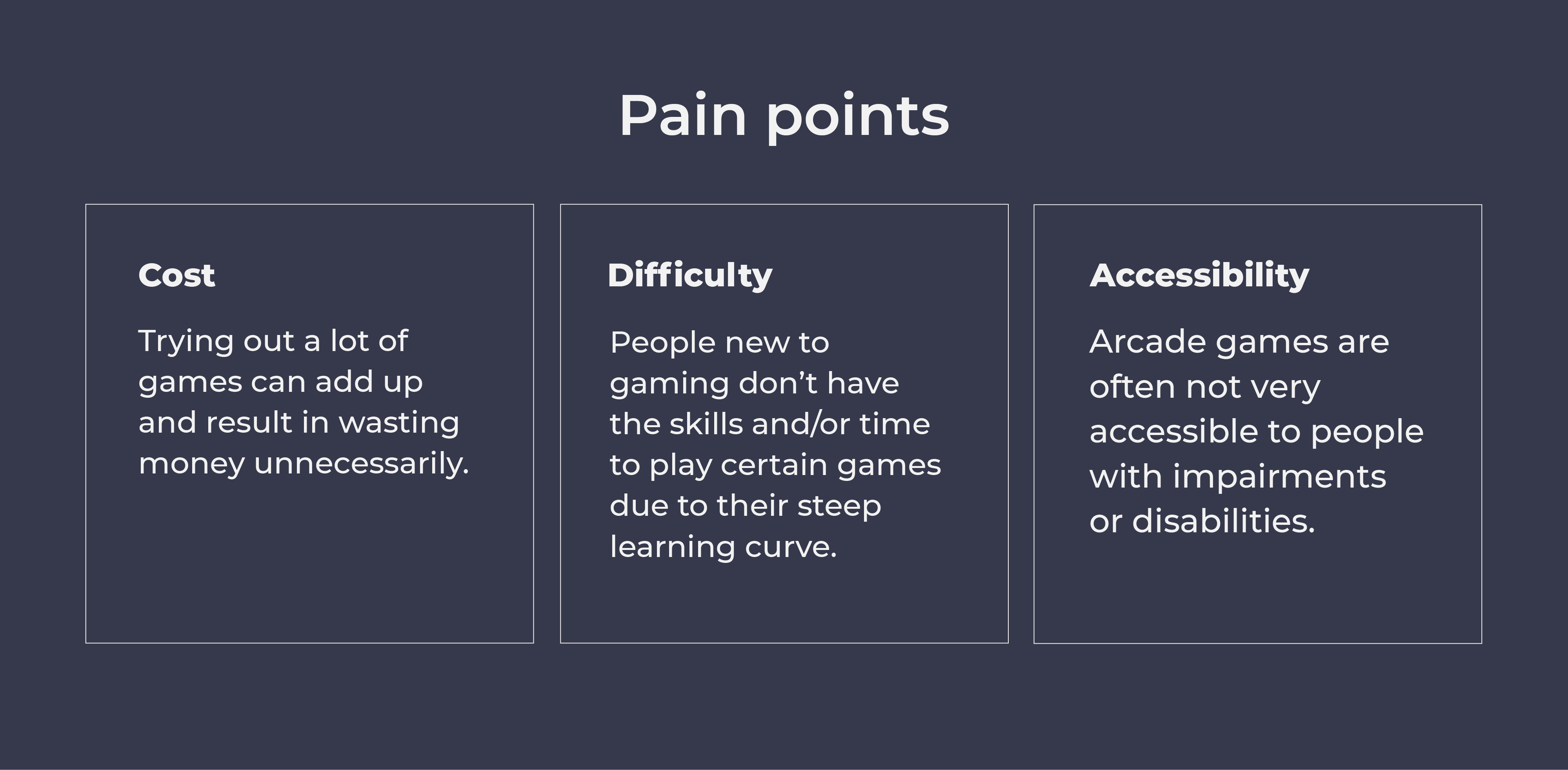
People who love to play Arcade games can have a hard time figuring out what games are available, what the games are about and if they would enjoy playing them. Occasional gamers might find certain games too advanced while avid gamers might have trouble finding people to compete with at their level.

The goal

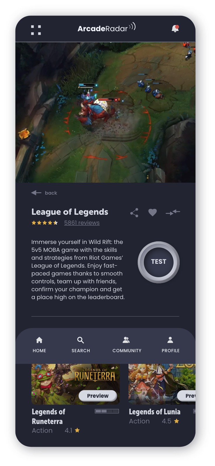
The primary goal was to design an app that allows users to easily preview and test Arcade games before committing to paying for them and not enjoying the games. The app also offers a way to connect with like-minded people in the community to talk about gaming, arrange meet-ups, or even find a mentor to advance their skills.

My role

UI/UX Design for the app and responsive website (personal project)
Conducting interviews, paper and digital wire framing, low and high-fidelity prototyping, conducting usability studies, accounting for accessibility, iterating on designs

View the prototype here

Photograph by Lysander Yuen

Understanding the user

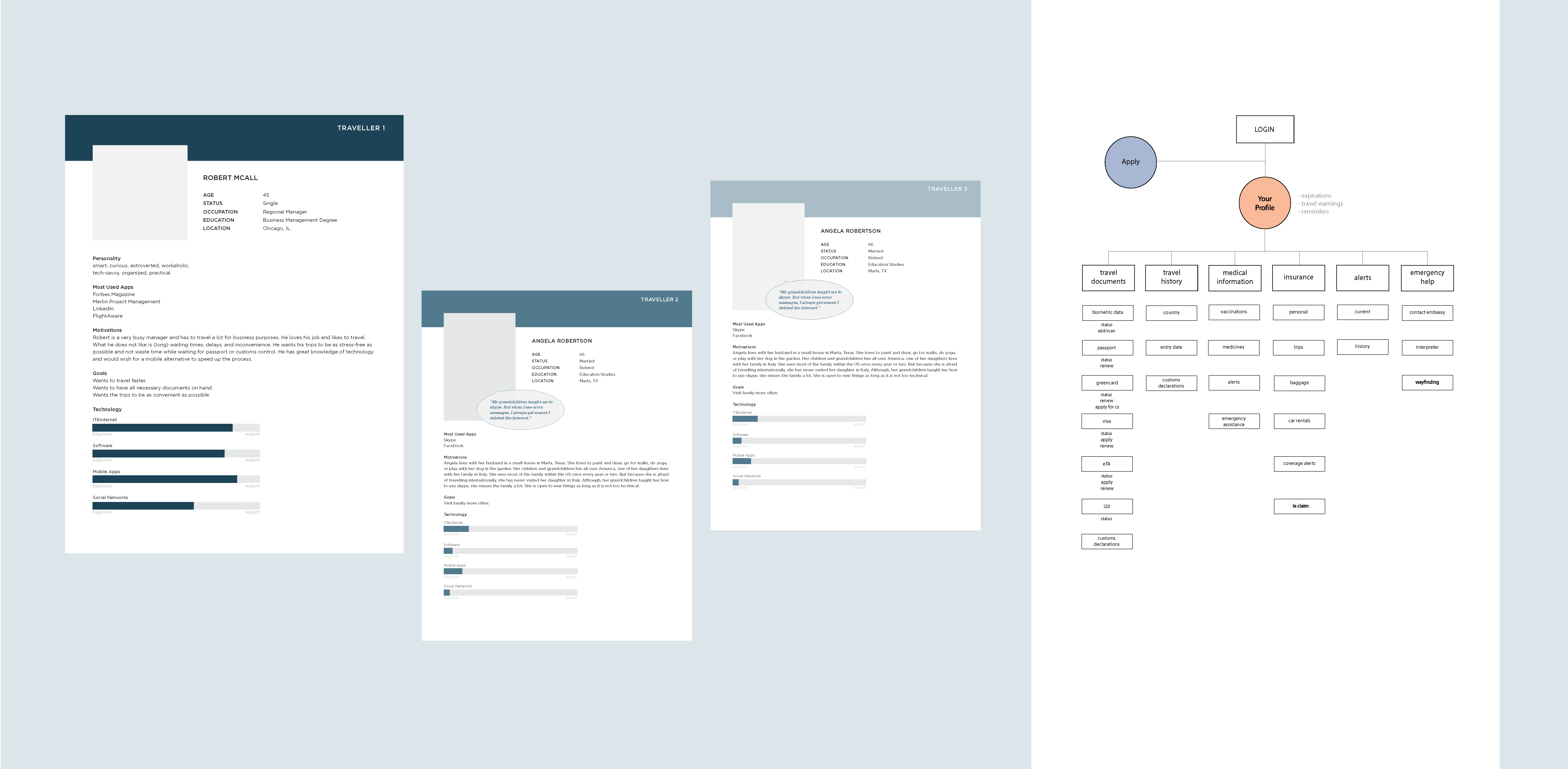
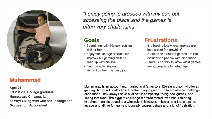
User research and personas

To empathise with the users and to understand their needs, desires, motivations and frustrations, I conducted interviews and built personas. Through research I identified game enthusiasts who don’t have an option to preview games without spending a lot of time and money as primary user group. This confirmed initial assumptions about ArcadeRadar’s customers. Research also revealed that other user groups include occasional users who are less advanced and users with disabilities.
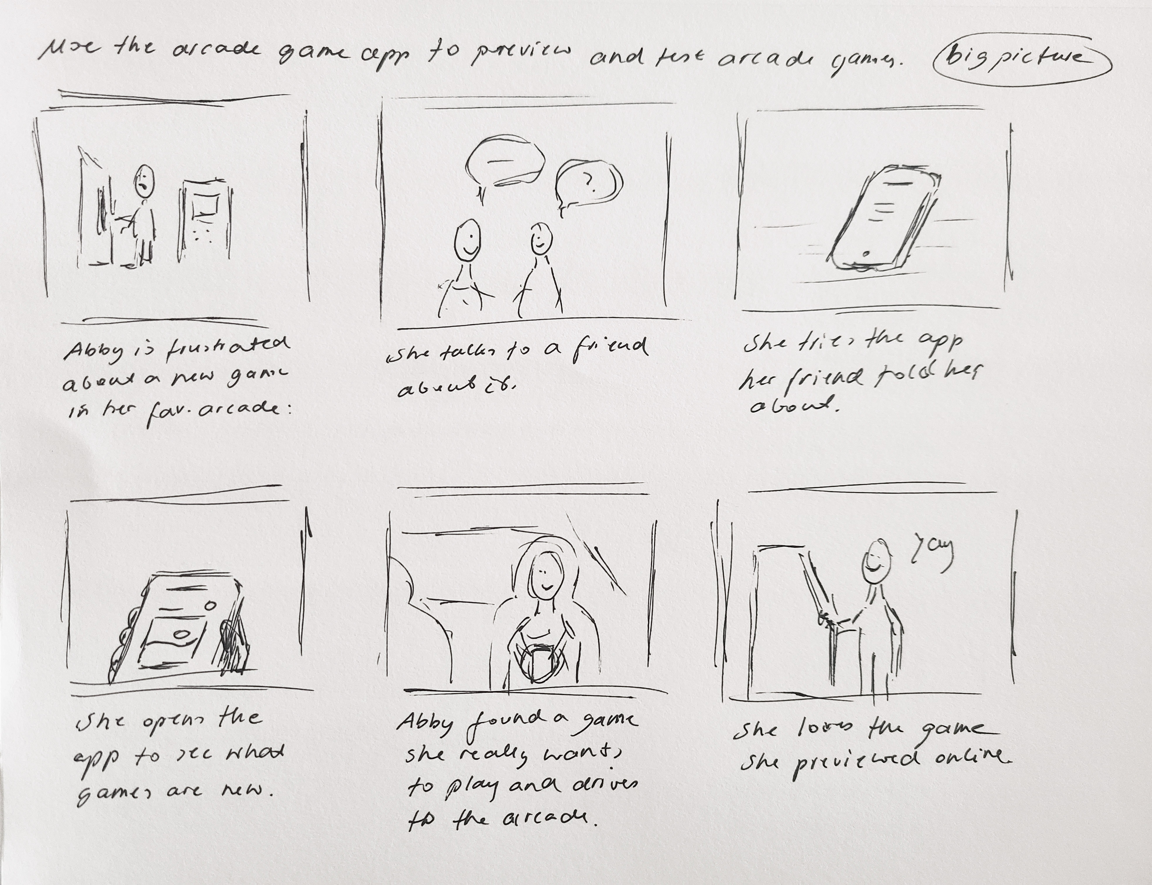
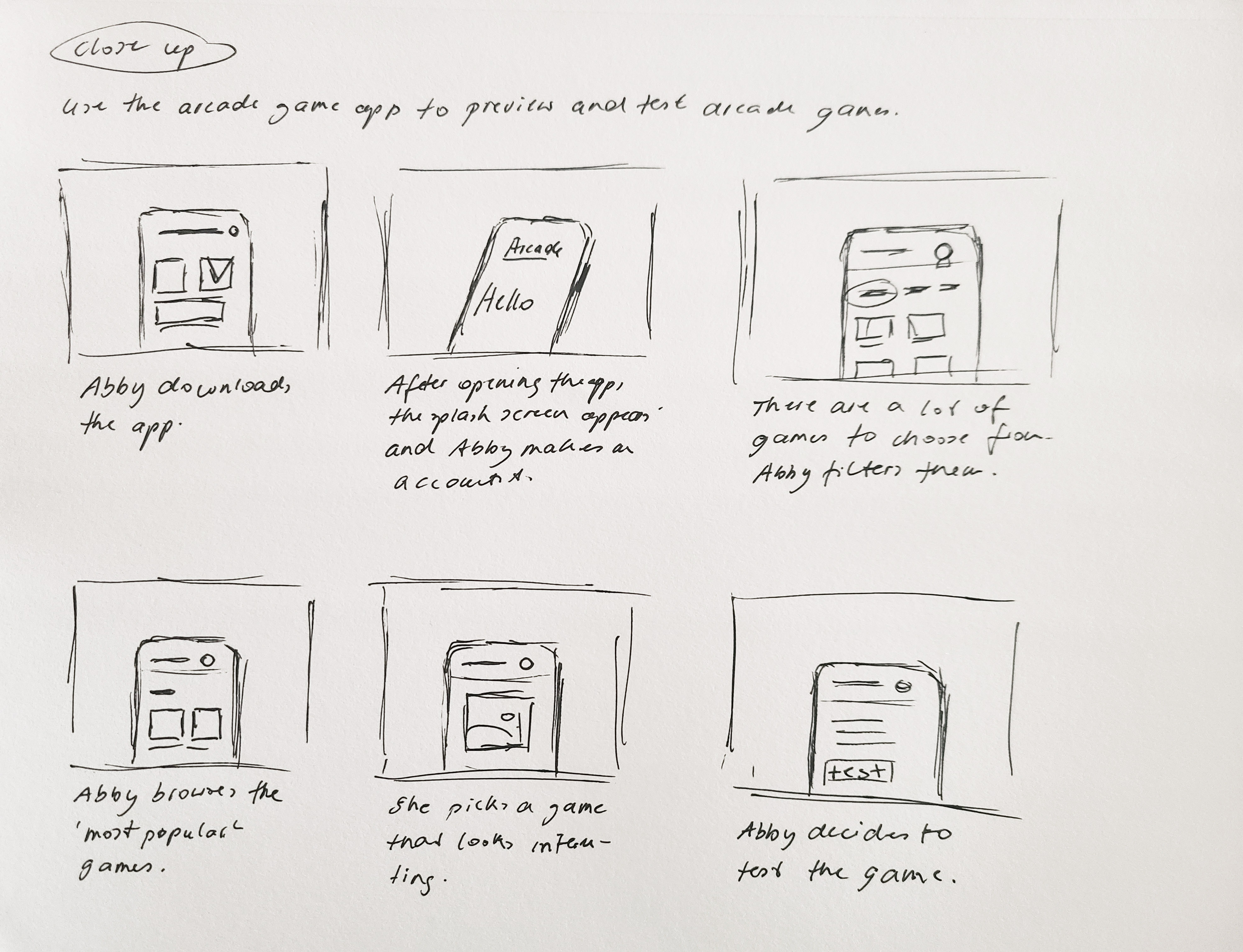
Ideation and design

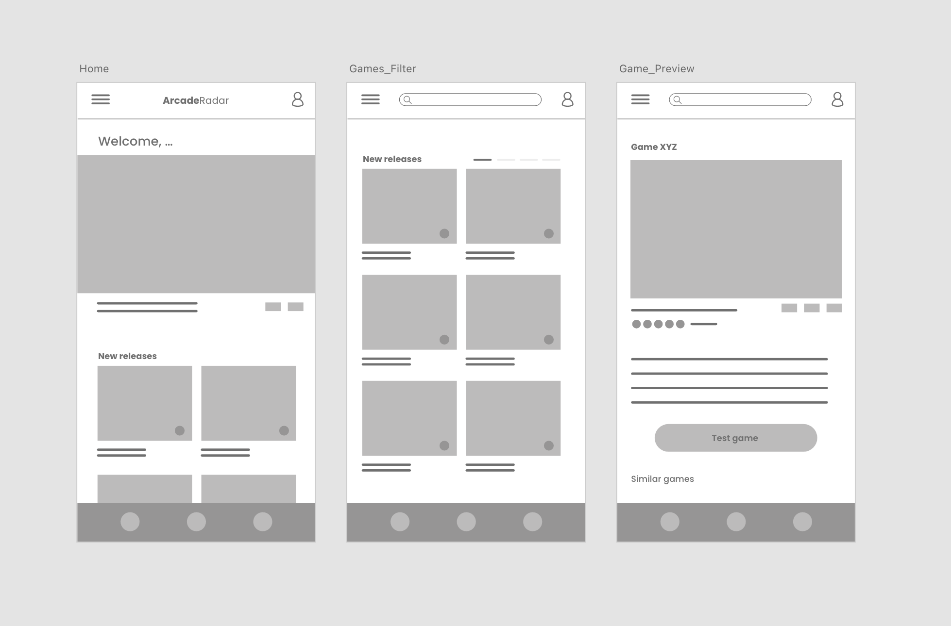
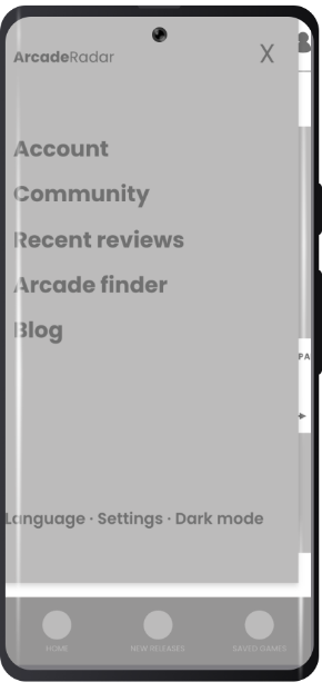
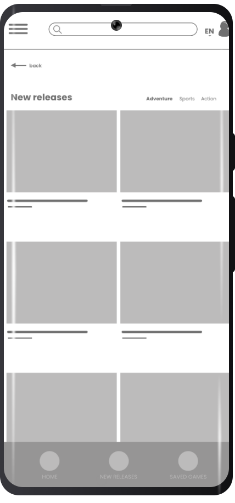
By sketching story boards I tried to visualise the user’s experience and explore possible user flows. Informed by user research, paper wireframes and story boards I started to create early screen designs for the app. Accessibility was one of the pain points that needed to be addressed in the design. Additionally, there needed to be options for ‘newbie’ gamers to find help and guidance.
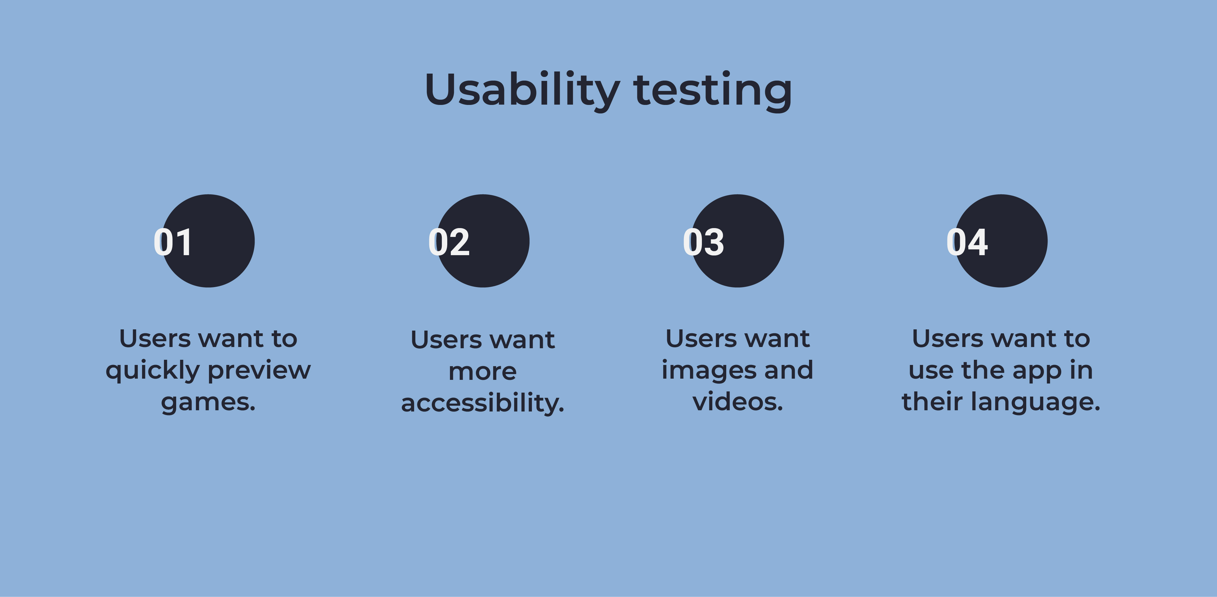
The test screen offers several options to take action by testing, sharing, saving etc.
The menu gives quick and easy access to support, community, settings and more.

Usability testing

I used feedback from usability testing to see if pain points were adequately addressed, if there are any additional frustrations and what aspects of the design still needed refinement.

Refining the design

Early designs allowed the user to click on an image to select a game. After usability testing I added additional buttons to give users more options and make the app easier to use. I also revised the layout of the listed games and filter option to make it more accessible for people with disabilities.
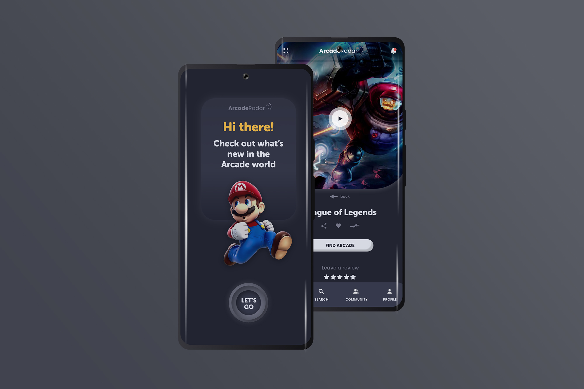
Before usability testing
After usability testing

Final designs

Rady · Rebranding Concept

Identity Design

MY ROLE

Brand Identity, UI

CONTEXT

Rady Children’s Hospital is the largest children’s hospital in California based on admissions and the only hospital in San Diego dedicated to solely pediatric care. The staff provide care for over 230,000 children each year. It is the region’s only hospital with a dedicated trauma center and a major pediatric clinical research facility.

The challenge of this rebranding was to make the experience of hospital visits and stays less intimidating to the little patients as well as guests while maintaining a high level of credibility, trust, and sophistication.

APPROACH

The updated visual language is built around the concept of color theory. Findings of psychological studies suggest that colors can affect emotions and behaviors of people. The new, predominantly warm color palette is based on these findings. It is welcoming, positive, and inviting.


Purposefully used throughout print assets, web presence as well as the hospital building itself, selected colors aim at conveying calmness, responsibility, energy, happiness, passion, enthusiasm and positivity. In creating a mascot (Rady Bear) that functions as the ambassador and face of the hospital, I wanted to enable children to substitute something potentially scary, the hospital, with something positive and fun, the bear.

sleep-center
Color selection example that combines happiness with calmness to enhance and ease the sleep center experience.

rady-wall1
An area where waiting time is combined with fun activities and energizing colors that distract both, children and parents.

Clean typography and the consistent use of warm and desaturated colors support the concise and catchy messages of the poster series in a playful and tangible manner.

rady_poster2

Putting the hospital’s logo and mascot on shirts, pins, and other merchandise is not only an effective way to promote the hospital, but can also help little patients and non-patients see the dreaded hospital experience from a different perspective. It might even give them a sense of pride wearing a cute shirt or pin with Rady Bear on it.

shirt1

Print material like brochures and stationery as well as the web presence are primarily targeted at parents. To ensure a seamless experience from gathering information, over making appointments, up to paying bills they need to be appealing, educational, well structured, and easy to navigate.

Brochure_Rady2

Photography is not mine but courtesy of respective owners.

USA.Gov · Digital Passport App

ui/ux

MY ROLE

UI, User Research, Information Architecture, Personas, Wireframes

CONTEXT

In today’s highly technological and digital world everything runs at a fast pace.
You read fast, you walk fast, you order fast, you eat fast. But then, why don’t you travel fast?
Long lines at airports are a familiar and disliked phenomenon to almost every traveller.
Digital boarding passes and self-service terminals have become very common at most
airports but still, air travel is far from being a fast and efficient experience.

SUGGESTED SOLUTION

The digital passport app is best understood as an extension of the services of
the US government’s web presence. The app is designed to make air travel faster and more
convenient. By utilizing digital technology, such as biometric data or a digital version of
the passport, it aims at speeding up processes like customs control or simply boarding
a plane. The traveler can access documents and travel history in one secure place.

the app provides

o digitized documents like passport, visa etc.

o higher security factor with fingerprint access only

o detailed travel history

o permanent resident status, tracking, renewal

o interactive translator, interpreter

o easy way finding to customs/border control etc.

VISUAL LANGUAGE

RESEARCH

Market analysis _ Competitive review _ Personas _ User journey

WIREFRAMING

Creating low-fidelity wireframes helped to visualize usability insights and a rough concept. Due to the amount of data that needed to be included in the app, a well structured and organized application was needed to enable a seamless and pleasant user experience.

DESIGN
the passport

Store all your biometric data in the app, login with your unique fingerprint, and have your passport available for scanning and identification wherever you need it in just two clicks.

travel documents and history

Access all documents you need for your journey as well as your travel history in one application. Find the hotels you stayed at, the flight numbers of flights you travelled on or what documents you used to enter a country you visited.

Photography is not mine. Credit belongs to the respective owners.