Identity Design
MY ROLE
Brand Identity, UI
CONTEXT
Rady Children’s Hospital is the largest children’s hospital in California based on admissions and the only hospital in San Diego dedicated to solely pediatric care. The staff provide care for over 230,000 children each year. It is the region’s only hospital with a dedicated trauma center and a major pediatric clinical research facility.
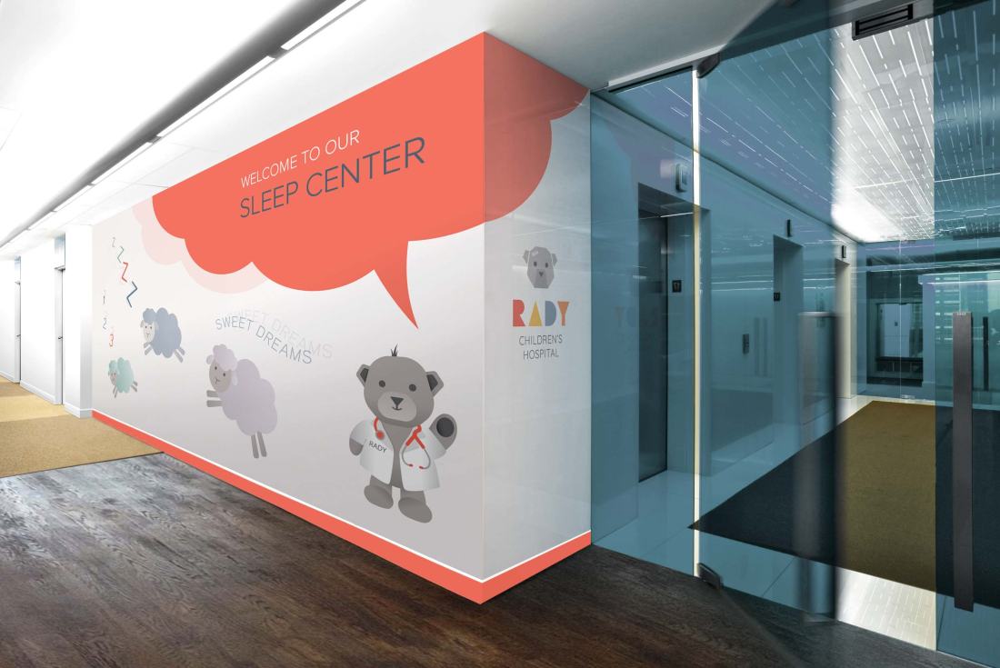
The challenge of this rebranding was to make the experience of hospital visits and stays less intimidating to the little patients as well as guests while maintaining a high level of credibility, trust, and sophistication.
APPROACH
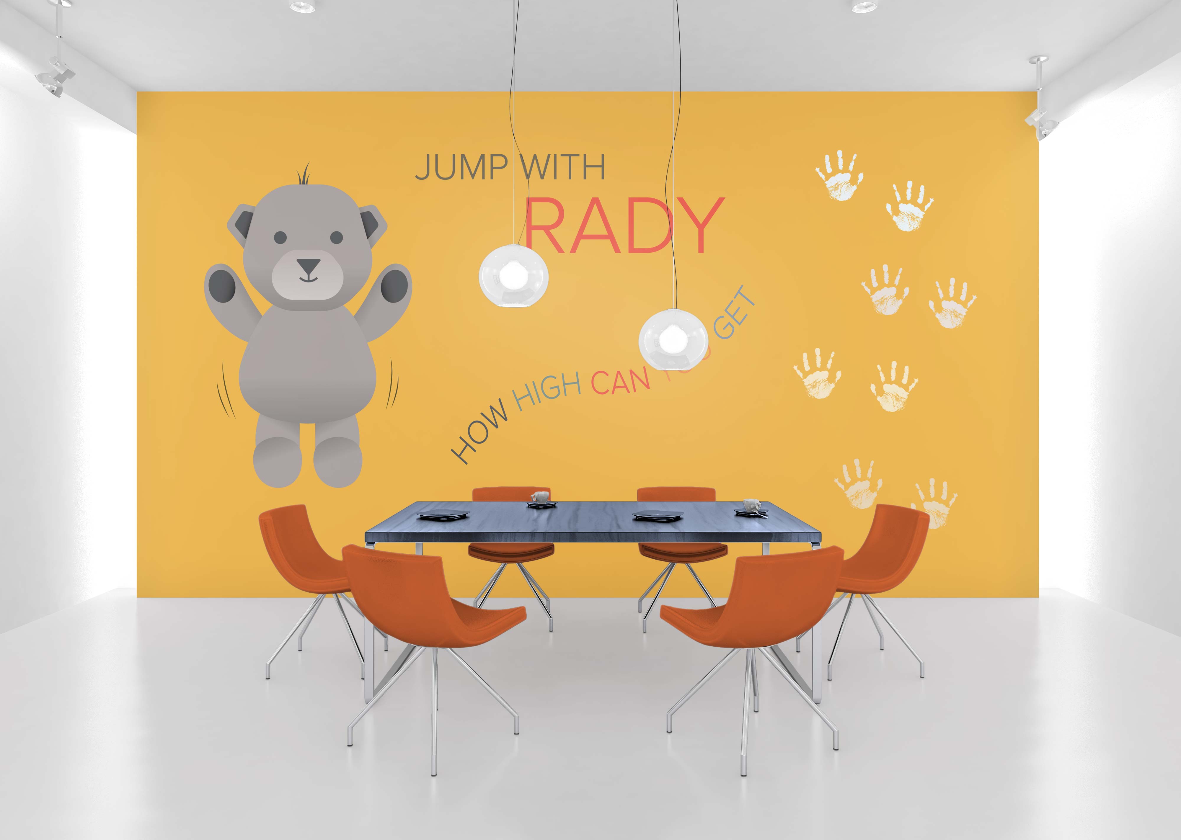
The updated visual language is built around the concept of color theory. Findings of psychological studies suggest that colors can affect emotions and behaviors of people. The new, predominantly warm color palette is based on these findings. It is welcoming, positive, and inviting.

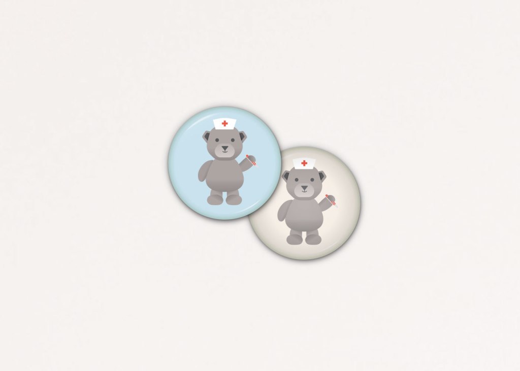
Purposefully used throughout print assets, web presence as well as the hospital building itself, selected colors aim at conveying calmness, responsibility, energy, happiness, passion, enthusiasm and positivity. In creating a mascot (Rady Bear) that functions as the ambassador and face of the hospital, I wanted to enable children to substitute something potentially scary, the hospital, with something positive and fun, the bear.

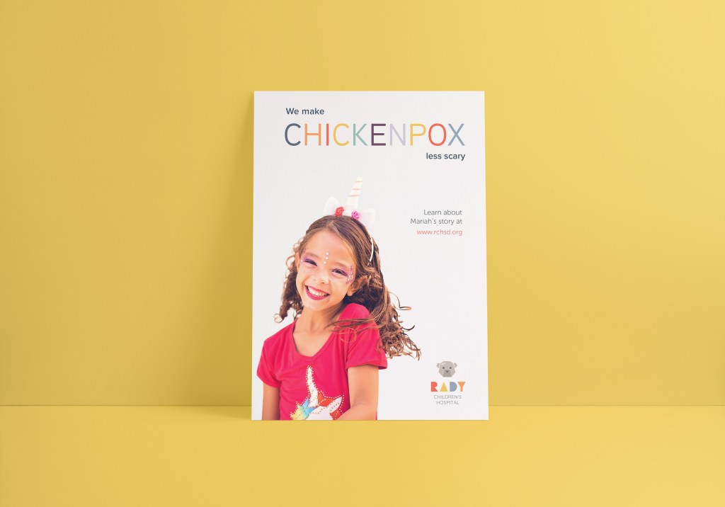
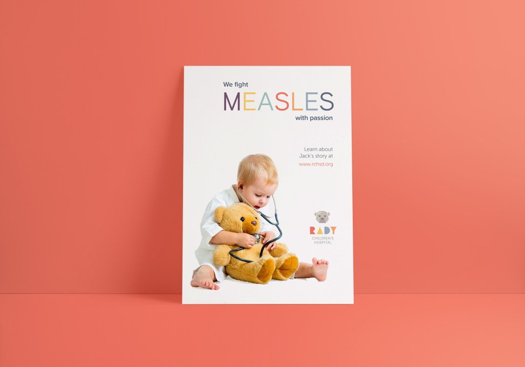
Clean typography and the consistent use of warm and desaturated colors support the concise and catchy messages of the poster series in a playful and tangible manner.


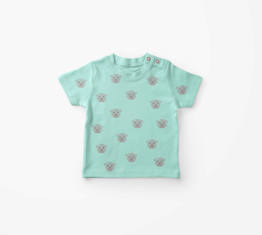
Putting the hospital’s logo and mascot on shirts, pins, and other merchandise is not only an effective way to promote the hospital, but can also help little patients and non-patients see the dreaded hospital experience from a different perspective. It might even give them a sense of pride wearing a cute shirt or pin with Rady Bear on it.


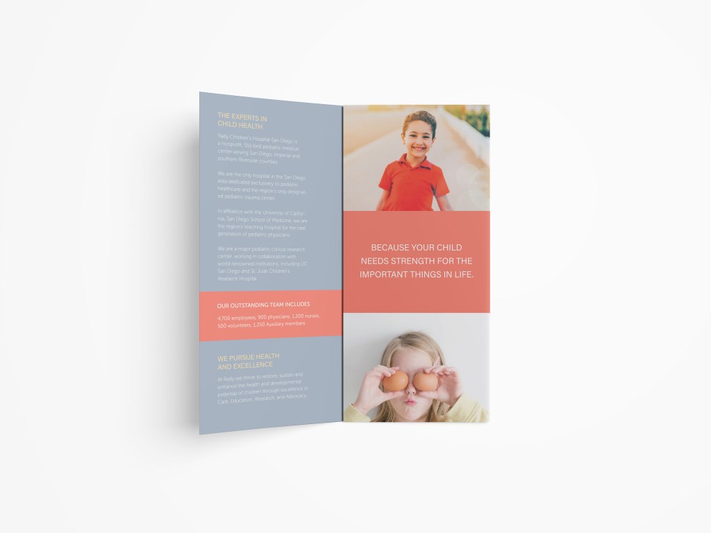
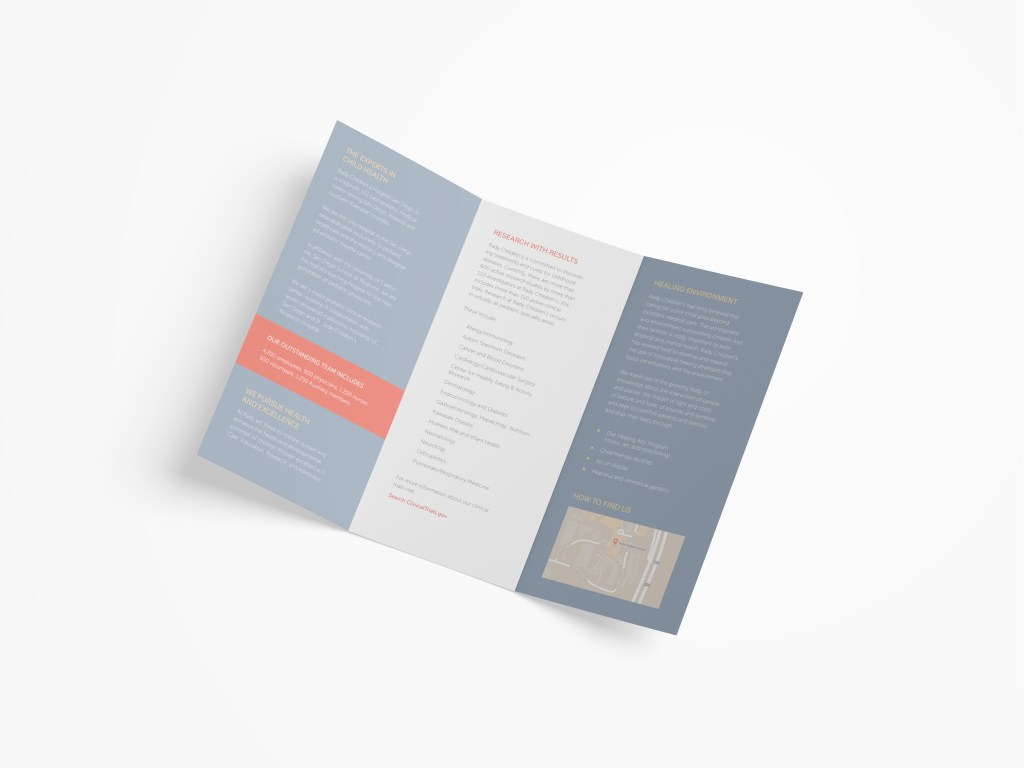
Print material like brochures and stationery as well as the web presence are primarily targeted at parents. To ensure a seamless experience from gathering information, over making appointments, up to paying bills they need to be appealing, educational, well structured, and easy to navigate.


Photography is not mine but courtesy of respective owners.
